
This is the first in a series of posts by guest blogger, Michele Harvey. Fenimore Art Museum will exhibit new work by Harvey in the exhibition Watermark: Michele Harvey & Glimmerglass, beginning April 1, 2010.
I needed to see the bones of Cooperstown.
The Fenimore Art Museum had requested I put together a landscape show with a sense of place. I had been to Cooperstown many, many times, but wanted to dig deeper. The scenery and history are unique. This presented an opportunity to explore and enlarge my understanding of this historic town. I turned into a tourist of the out-of-the-way. It is a place to capture the imagination. Each foray would present a different understanding, which would feed my creative vision.
 As fate would have it, one of the first things to catch my eye was a Candlelight Ghost Tour of Cooperstown. Being open but skeptical, I waited on the corner of Pioneer Street and Main, for my host. The night was chilly and misty and I was the only soul to brave the weather. Bruce Markusen (a docent at Fenimore Art Museum by day) was my dauntless guide and led me through an interesting, eerie romp of the town. An excellent storyteller, Mr. Markusen captured my attention from the first footstep. Being a historic tour, I was free to satisfy my interest with a side of a Cooperstown rarely seen. I will not give away the punch line, but Cooperstown will never seem the same in broad daylight again. I did walk the same route, the next morning. There it was. The town was decidedly different.
 This led me to my next stop. A park oddly named Indian Grave. From the street it appears an unremarkable greensward, dotted with old trees. But the roadside plaque tells the tale and invites invitation. Inside an iron gate, the landscape alters. Looking back upslope, to the street, one clearly sees the sharp outline of a large burial mound. Here the bones of an Indian had been discovered, disinterred and reburied with honor in 1874. It's very close to the Susquehanna River. Near where other Native American graves were known to exist. One may only guess, it being a choice location, that there was some reason behind such a regal tomb for the remains. After all, it was only a block away from the busiest part of the Ghost Tour and it's spectral sightings.
In my next post, I hope to enchant you with a tale of Fairy Springs and it's surrounding haunts.
 By crating standards it really isn’t that large, but this is the largest crate that has come into Fenimore Art Museum during my time here as Registrar. Despite receiving measurements from the crate fabricator and checking the maximum door height of our loading dock prior to shipment, upon delivery I discovered that the crate simply wasn’t going to make it through our loading dock doors and down the winding halls to the Great Hall Gallery.
  Needless to say this will all have to be done in reverse in January when it is time for the loan to go back to Spanierman Gallery. By then there will be snow to contend with on the back lawn of the museum…but that is another blog.
 The second of those two lives was captured on film by the photographer Hansi Durlach who was born in 1930 in Vienna, Austria. From 1968 to 1972, she shot the majority of the Sharon Springs photographs and they were eventually published in the 1980 book The Short Season of Sharon Springs: Portrait of Another New York. Stuart Blumin, professor of history at Cornell University, wrote the text of the book. In October 2001, Durlach gave the Fenimore Art Museum a collection of over 300 of her photographs and negatives of this small town. After having just fell in love with Sharon Springs, I was so excited for the museum to receive this collection.
 Sharon Springs began its history as a spa resort in 1825 when a David Eldredge set up a boardinghouse there, almost a quarter century after Saratoga Springs, 60 miles northeast of Sharon Springs, became a resort town. Eldredge’s investment was meant to attract visitors to the natural mineral springs located in the village. During the heyday of Sharon Springs’ popularity, the majority of the visiting population was Protestant. Also included, however, was a population of upper-class German Jews from Manhattan who were accepted into the Protestant society. When spa-going fell into disfavor, the Jewish population chose to continue visiting Sharon Springs and by 1900, they comprised the majority of the summer population. After World War I, less prosperous Eastern and Central European Jews from Brooklyn replaced the wealthy Manhattan Jews. More specifically, the Sharon Springs Jewish population was Hasidic Jews of the Satmar sect. In the late 1950s, a Satmar Rabbi from Brooklyn, Yoel Teitelbaum, began visiting the village and many of his followers followed suit. Even after his death in 1979, a few Satmar continued to visit the baths, sustaining Sharon Springs’ status as a resort for a few more decades. They found the new solitude of Sharon Springs a welcome change from the hectic pace of life in the city – a place where they could enjoy the health aspects of the town without the social pressures of the previous era. At the time of Durlach’s project, Sharon Springs’ visiting population was a largely older group of Hasidic Satmar Jews who had been coming since the days of Rabbi Teitelbaum.
  There is no question of her success in achieving her goals. Durlach’s photographs are infused with the strength, spirit and passion of a people committed to the memory of the past, the distinction of the present, and the optimism of the future.
  Want a hint? Think chamber pot. Still confused? Well this chair is actually a potty chair, or close stool. The large decorative elements hanging down from the chair are used to conceal a hanging chamber pot. Though the framing to hold the chamber pot is long gone, the heavy corner blocks and concealment elements tell us what we need to know about the chair’s purpose. On the arm there is a plaque too that reads in part: “1738/Brought from England by/Sir Wm. Johnson.” That’s right; this was the potty chair for Sir William Johnson.
 The chair is in the Rococo, also referred to sometimes as the Chippendale style and includes the typical motifs; ball and claw feet and in this case, two pierced back splats. Like most Rococo designs, if you look at this chair, it almost seems alive, think Disney’s “Beauty and the Beast.” The legs appear as if they’re ready to walk away, the arms almost embrace you when you sit. This is my favorite style of furniture, for a variety of reasons, but mostly because the craftsmanship that went into making the furniture during this time period was astonishing. I can’t imagine making furniture like this, though I have to admit, I thoroughly intend on trying.
 Why refer to the club as a “calling card?” The 17th century Captain William Hyde explains, speaking of the Iroquois: “Now When These Men Goe a Scalping in Canada, they scratch the markes they have on their faces and bodyes upon their Clubhamers which they always leave behind them with the dead body, that it might be Knowne who did the action.” It was also a powerful statement to leave your war club next to your slain enemy’s body on the battlefield.
 War clubs were often inscribed with personalized information and messages. On this club the self portrait features the owner’s tattooed face; a rayed sun motif at his mouth, a straight line and a dotted line running diagonally across his face, and a zigzag line arcing over his left eye. The small notch in his ear indicated that there may have been a feather or down decoration there. The self portrait is linked through a “power line” with an image of a turtle, the owner’s guardian spirit, on the other side of the club.. Warriors also ornamented their bags, spoons, bowls and other personal items with their particular guardian spirit. Also present on this club are markings illustrating the owner’s war records, or records of his war exploits; two slain enemies are visible under the turtle. A wolf with his tongue lolling out adorn the end of the club, its eyes were likely once inlaid with shell.
 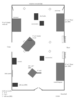 You can imagine our delight when we found the beauty of designing in a graphics program. Yes, you still had to make a floor plan and size stuff, but no one could knock the darn thing off the table and scatter little pieces of paper to the wind. You could even create multiple versions of a layout and email them to your colleagues! Ya-hoo, we were talking progress.
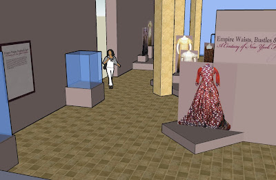 At this point many of you are nodding your heads and saying oh yes its Sketch-up (from Google). You would be right. For someone who started out way back using little cutouts to do floor plans this is indeed and amazing program. It is fairly intuitive to use. I find myself gaining skill as I go along. It does not do every single thing I would like it to, but it is a wonderful tool for giving you a fairly accurate feeling for how a gallery will look upon completion.
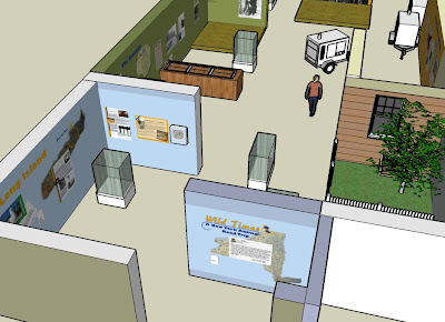 My next trick will be to learn how to interface google earth and sketch-up. The possibilities seem endless and as the technology evolves there will always be another exciting opportunity to do it better.
 Another miracle work performed is cleaning the dirty eagle feathers on the full headdress in the collection. Shaun has cleaned each feather individually with a solution applied with a small brush. The dirt is absorbed by a cotton pad that is placed behind the feather being treated and when the feather dries it is clean. Guess it’s a bit like when the feather was attached to the bird. Rains outside – wet bird, stops raining - the bird dries. Seems pretty simple or what? However – not so when you are dealing with a museum artifact. I have to admit to frail nerves when they started to wet the first feather and of course as long as the feather was wet it looked like a drenched cat. Not good for a curators’ nervous system. What have I done, what did I approve?? What if it never looks like a feather again? It is ruined!! Not so, the feathered headdress is looking its stunning self. The dark coating is off the delicate feathers and although we are not trying to make things look new – it looks refreshed and once again more detail can be seen.
 Imagine then, if you will, my amazement as a student, and later in my current position when I found a desk, taller than me, that was married to a bookcase, had pressed glass handles, and was painted blue and green on the interior. I’m not sure shocked even begins to describe what I first thought. But someone obviously appreciated the desk (the original piece) and the bookcase (the later addition) and wanted to have one piece of furniture that they could use and enjoy. Why it has a blue interior on the bookcase and green shelving in the desk area is beyond me, and I doubt we’ll ever know, but it adds charm to the piece regardless.
 Many paintings in our permanent collection have devoted fans and when they are removed from exhibit we inevitably receive inquiries as to their whereabouts. Paintings need to occasionally be relocated to storage in order to prolong their life as well as to allow for other works in our collection to be seen in the finite gallery space, and sometimes paintings go out on loan to exhibits at other museums. Of course, the positive outcome of loaning a painting from our collection to another institution is that it will exponentially increase the visibility of the painting and further educate the public about folk art and the collections at Fenimore Art Museum.
 It takes a lot of time and work on the part of both institutions to make a loan happen; I have been preparing for this particular loan for over two years. Loan agreements were signed once the conditions of the loan were finalized between institutions, I completed a condition report on the painting and our conservator made sure it was secure and safe to travel, a specialized crate was fabricated and the painting packed, insurance coverage was established by the borrowers, and shipping with a fine arts handler was scheduled. Because of the importance of this painting, I couriered the painting to the Metropolitan Museum of Art and we will oversee installation and deinstallation at each venue; a perk of the job! I must be intimately familiar with the condition of the painting in case something changes during the loan period, as well as specific installation and display requirements. Fortunately, the borrowing institutions have excellent security, art handling, and conservation staff that will make my job easier.


