When I first started at Fenimore Art Museum we would lay our exhibits out on graph paper. A scaled outline of the gallery would be laid out and we would painstakingly make little cutouts of paintings, sculptures, and exhibit cases. Then we would slide them around our floor plan until we got them where we wanted them. Little dabs of glue stick would hold them in place until some poor soul accidentally gave the page a good knock. Then your gallery got “redesigned” and you spent time muttering under your breath while you tried to get it back in order. 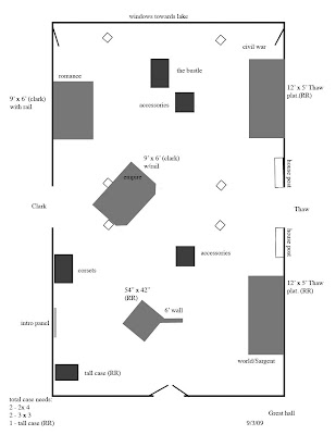 You can imagine our delight when we found the beauty of designing in a graphics program. Yes, you still had to make a floor plan and size stuff, but no one could knock the darn thing off the table and scatter little pieces of paper to the wind. You could even create multiple versions of a layout and email them to your colleagues! Ya-hoo, we were talking progress.
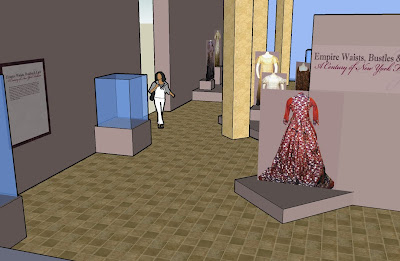 At this point many of you are nodding your heads and saying oh yes its Sketch-up (from Google). You would be right. For someone who started out way back using little cutouts to do floor plans this is indeed and amazing program. It is fairly intuitive to use. I find myself gaining skill as I go along. It does not do every single thing I would like it to, but it is a wonderful tool for giving you a fairly accurate feeling for how a gallery will look upon completion.
 You can imagine our delight when we found the beauty of designing in a graphics program. Yes, you still had to make a floor plan and size stuff, but no one could knock the darn thing off the table and scatter little pieces of paper to the wind. You could even create multiple versions of a layout and email them to your colleagues! Ya-hoo, we were talking progress.
So, imagine the delight and disbelief when we stumbled across a 3-D design program that was actually user friendly. This baby could help you lay out a gallery in 3-dimension, color the walls, chose floor treatments, place paintings and allow for 3-d views that made you feel like you were walking through a dollhouse. And (are you sitting down?), it was free.
 At this point many of you are nodding your heads and saying oh yes its Sketch-up (from Google). You would be right. For someone who started out way back using little cutouts to do floor plans this is indeed and amazing program. It is fairly intuitive to use. I find myself gaining skill as I go along. It does not do every single thing I would like it to, but it is a wonderful tool for giving you a fairly accurate feeling for how a gallery will look upon completion.
I used the program last year to good effect in laying out America’s Rome and the overall graphic treatments in the gallery. It was invaluable for figuring out how many animal-related objects could fit in the main barn for the Wild Times exhibit, and how the colors and graphics would relate to each other as you moved through regions. This year I have been laying out platforms for dresses for next year’s Empire Waists, Bustles and Lace exhibit.
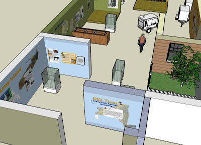 My next trick will be to learn how to interface google earth and sketch-up. The possibilities seem endless and as the technology evolves there will always be another exciting opportunity to do it better.
 My next trick will be to learn how to interface google earth and sketch-up. The possibilities seem endless and as the technology evolves there will always be another exciting opportunity to do it better.


2 comments:
Thanks for the inside look on how you visualize the inside look of your exhibits.
Your use of this 3-D technology might make an interesting offering as part of your on-sight educational programming for student visitors. I can see it providing a fresh avenue of access for students to engage ideas about aesthetic decision-making as well as traditional visual devices like perspective, textures, etc.
Thanks for your response. Sketch-up has been a great tool and i feel like I am still just scratching the surface in many ways.
We do some educational programming here and I recently used printouts from sketch-up to explain to students what my job was about and what was involved. As it is such a user friendly program and is free, it might be a great tool for in the classroom at school.
Post a Comment